Fox 3d |
Click here to add your text. |
Well it's finally happened, Fox has made the jump to 3d, and bext of all.. He looks "badass" as most people have told me. During quarter 8, I had to do an animation with some character, for 30 seconds. Well Cade was way too high poly.. so it was time to make a new one. Since I came to this school, one goal i've had was to make Fox in 3d, and make him damn good. Well look no further! It's no masterpiece, but I'm very happy with it. Plus, I never touched any 3d program before i came to AIP, so to do this.. within a mere year of working on it, well, i've amazed myself. Anyway, enough shameless self promotion.. Lets get on with it! |
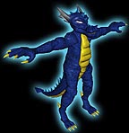
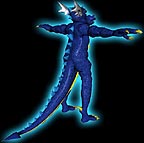
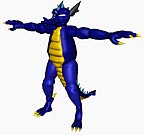
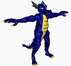
Simple stuff, Front and back views, and a close up of his head. The head is extremely intensely mapped. If you know anything about 3d mapping, it has 8 UVW's on it, to get the varying sizes of scales over his face, the whole this is mapped with a composite material. And if that makes no sense to you.. don't worry, just know, it's intense stuff. |
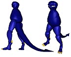
I figured, for the hell of it, i'd show you the steps I took in making Fox in 3d. So this right here, is the first day of working on him. Very simplistic, basic idea of the shape type stuff. Note that this is also A good way to do 2d stuff, start simple, and work up. |
I don't recall what day this is, I'm skipping around here for load time purposes.. I think it's like day 3 or something. It's all of Fox, without the extra things like an underbelly, spikes, and claws. |
This is Day 4! I know because thats what the file is called.. Now, originally,he was supposed to be low poly. The face count was supposed to be under 20,000, and if you don't understand that.. just know that more faces, means things work slower. It takes longer to render, and all that great stuff. So I could have stopped here.. and been done.. But people said, "why dont you add muscles and bulk him up some!" And So.. |
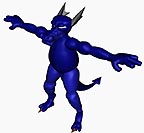
I went overboard and really detailed the HELL out of him.. That happens alot.. me going overboard.. The above picture was like, 24,000 something faces, and this one's around 47,000.. so just by adding muscles, I just about doubled my face count. Yes.. it is insane.. but man, he looks SO much better! Unfortunately.. alot of that kick ass detail is lost, when the texture is slapped on, but at least you can see, yes, it is there. |
Final versions |
Step by Step... |
Mortal Kombat! Except.. not |
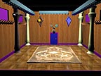
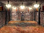
No.. not this one.. The Arena Below is where people said "that looks like MK.." But this was my first one, tthe first crap idea.. It was originally going to be some simple dojo. See, this is where Fox and the Biped fight, thats the link that says "Biped Battle" on the other pages. So This was going alright.. but i didnt really like it, i wanted it much more menacing looking.. dangerous and stuff. This isn't finished with the textures and such, because I killed the thing halfway through. |
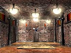
After I trashed the dojo, I came up with this. And note that It wasn't on my own, i asked alot of people for help in ideas for it, So thank you.. you know who you are. Anyhow, I whipped this off, and I LOVED it, but something just didn't look right.. The majority said, it was that rug.. so with another friend's suggestion, I decided to make the design, actually part of the floor. |
And you get this, The final arena. Look dangerous enough? Unfortunately.. most of the camera shots are in so close, you don't get to see all this! But again, Heres my proof that yeah.. theres alot I have for this. |
"What the hell is up with those ball thingys?!?!" |
Like an idiot, I forgot to hide those when I rendered this.. 3 TIMES! But the ball is just for reference, and it's a point of rotation. In MAX, you can rotate around an object.. but with this, theres nothing TO rotate around! It's a big open room.. So i put that ball in the dead canter, so I can spin around the room with ease. Smart eh? Yeah.. i'm a genuis.. ^_^ |
All Pictures, Characters, and etc.. Are created by: Nathan Horsfall Copywrite 2003 and beyond |

