FotHB Website Graphics

Just taking the title graphic and adding "website" in there. Trying to give it that Matrix-sih look too. Like it's computerized in some way. And of course, feathering off the edges of the main graphic with this "constellation" filter which comes with the Xenoflex 1.1 plug in. It's great stuff!
I don't even rememver what i used to make the background, but it;s supposed to look kind of like what the time stream COULD look like. And that nose blasting through the middle is meant to be FotHB making it's dent in the stream of time.
Made: 2000


Just basic stuff here, No real reason other than "it looks cool!" Used the "constilation" filter on the word "credits" to give it that look.
Made: 2000

Same thing with this, basic stuff for no real reason!
Made: 2000

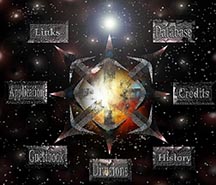
Now this, was a really fun and cool project. It';s the old linkmaster, before the one below this, which is the new one. I created this based off an old friend's idea (Tom Bolton), to have it so there was chaos in the center, and out from the chaos you find tyou way, using the guild and it;s links. So the concept is "Out of the chaos, you will find FotHB". Tons of stuff going on there. Lots of lighting effects, carves on the arrows (eyecanday 3.0 filter), and lots lots more. I made that space background myself, however.
This picture is actually huge. it's the ONLY picture you can click, that will enlarge. So go check it out!
made: 2000

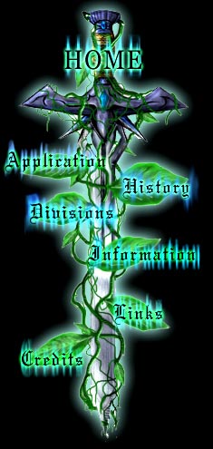
Wait wait wait.. is that the MAIN site linkmaster? But.. a little different? Yes, yes it is.
I originally drew that sword for the guild's website, but it was so much work, and turned out SO well, that I took it for myself also.
IT'S MINE! I CAN DO THAT!
*ahem*
This actually looks cooler though, because since I haven't figured out how to code a picture so clicking on different parts of it will actually take you to pages, I cant' have those cool graphics. So instead, I have text.
I decided since this was a huge scale project, I would show you the steps I took to make it, which is found below. Enjoy!
Made: 2001
Lets make a Linkmaster!
*Click any of these to enlarge*


Start with a drawing, then bring it into photoshop. From there plut some flat colors on each piece and do some basic shading on it using the burn and dodge tool. Okay good. Now continue that concept and finish it off. Remember! It's metallic, so it should definitely be shiny and almost reflective in some cases. Alright, now draw some lines for what the vines will be. Just generic green color. We'll worry about the shading in a minute. Okay, add a little bit of shading with the burn and dodge too, and grab a smaller brush and add more small vines in there. Again, don't worry about shading. NOW lets shade. but boy.. thats gonna be a bitch.. lets just use the Carve tool (eye candy 3.0) and do some quick shading. Then go in there and clean it up. burning and dodging in different spots. Where things should get shadow and stuff. But you know.. those vines are pretty blah at the end of the tip.. lets delete that, and have them more or less flow into smaller ones instead. Looks more natural. Use the small brush for thise. Now lets add some leaves. Don't worry about putting lots of detail in, cuz when we add the text and glow.. they're gonna get covered up. And all that work would be for nothing! So just draw them the same way you did the vines, and burn and dodge to get them LOOKING 3d. Heres an idea though.. Lets only make ONE leaf, spend a good amount of time on it, then scale and rotate and change the lighting on it to make it LOOK like we made six, but in reality, we made one and them duplicated and altered it to get six. Yes, time savers are good. Alright, now lets add some really cool glows around where the words will be, and around the sword! Theres many different ways to do this, but use vertical motion blur for those glowing "lines" of sorts. Now add some text and put glow on it, and you're done! Wasn't that EASY?
All Images created by Nathan Horsfall
Copyright 2002 and beyond