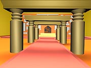
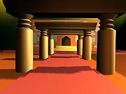
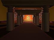
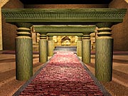
This assignment was to create some 3d environment, without textures, and light it 3 different ways to make it look different, and convey a different mood if at all possible. So for this, I used my temple sketch (backrounds page again) and it was pretty easy to make. the end building was kind of a pain, but not too bad. The Lighting was hard however, and that took a REALLY long time. But, here we have the same exact picture, lit in 3 totally different ways. This was neat, because you dont usually think about how much lighting sets mood, but if you look at this, dont you get a totally different feeling from each picture? It was really cool, and a valuable part that I've incorporated into my drawings and other 3d projects. |
The first step is to model the thing out of course. does this look familiar to you? If you saw the backrounds page already, it should! This was especially easy to model because I drew up a sketch of it first, then had something to go by. And if it looks hard, it actually was very easy. like those archways? just draw one, then duplicate them across. and the buildings are just boxes. This is what it looks like with no textures at all, except on the windows a LIITLE bit. |
MAX Class 1 & 2 |
All the work from this page is from MAX classes in my 1st and 2nd MAX classes at AIP. Listed in chronological order so you can hopefully see improvements. Some too, like the Cold Future project, show exactly what steps I took in creating it. Which can be educational if you're interested in getting into this stuff, or just find it fun to look at. Either way, enough talk, enjoy. |
This is my first 3dsmax project ever, done with Max R3. We had 2 weeks to do this and I saved a few of my early pictures so you can sorta see how it all came together, and what a difference certain things (like texture) make. I called this "Cold Future" for a reason, but thats revealed at the very end. |
Cold Future |
The first step is to model the thing out of course. does this look familiar to you? If you saw the backrounds page already, it should! This was especially easy to model because I drew up a sketch of it first, then had something to go by. And if it looks hard, it actually was very easy. like those archways? just draw one, then duplicate them across. and the buildings are just boxes. This is what it looks like with no textures at all, except on the windows a LIITLE bit. |
Secondly, after I model it out, now I have to texture it. The best way is to make the textures in photoshop, because you can make ANYTHING, and if you've been paying attention to the art, you know that I know photoshop. So the textures were hard, but easy at the same time. Because I could do anything I wanted with it. I guess a better way of saying it is time consuming, like the right building for example, took me about 2 hours to create a texture for. But see the difference? it's amazing how drastic a change they make. All that isn't textured here is the ground, but that was easy enough. |
And here we have the picture totally textured with some funky colored lighting going on. I actually lit it like the last one is, but then for the heck of it, i messed with the colors to get a different look. I've been told this is very doom/quake looking. But when I asked around, most liked the blue look better, so I went with that instead. Which is just two down from this |
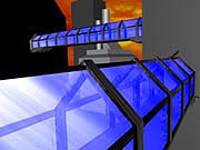
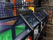
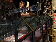
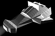
Now whats this? well on the FINAL picture, I added this car to it, twice in fact. The picture was nice, but I felt it could use something more. So I Box-modeled this car out and threw it in there. I Show you the car in these different views, and in very large size because on the picture, as you can see if you look below, the cars are VERY VERY small, so you cant even see the amount of detail I've put into this thing. |
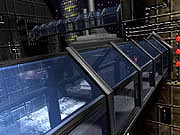
Finally, we come to the finished project. Lit, textured, and modeled, and that car thrown in there. So why the title "Cold Future"? Well, to me, this scene doesnt look very lively. it looks very technological, but there hardly seems to be any people around. Heck, those cars might be programed robots, you dont even know. So theres not even a single trace of nature anywhere, all metal, and the whole feel of it just seems cold. This is my view into the future we're heading to. Where everything is techonological and even human kind is scarce. And yes, thats been envisoned before. Well where do you think I got my idea? Still, I'm extremely happy with this assignment. Not bad for a first run huh? |
The Temple |
This assignment was to create some 3d environment, without textures, and light it 3 different ways to make it look different, and convey a different mood if at all possible. So for this, I used my temple sketch (backrounds page again) and it was pretty easy to make. the end building was kind of a pain, but not too bad. The Lighting was hard however, and that took a REALLY long time. But, here we have the same exact picture, lit in 3 totally different ways. This was neat, because you dont usually think about how much lighting sets mood, but if you look at this, dont you get a totally different feeling from each picture? It was really cool, and a valuable part that I've incorporated into my drawings and other 3d projects. |
Sunny |
Dawn |
Dark |
All pictures Created by Nathan Horsfall Copyright 2003 and beyond Pictures were all created using 3d Studio MAX R3 |
Finally, we had to texture, relight it, and do whatever else we had to in order to make it as realistic as possible. So here it is, I also added a blur filter over it in photoshop, to smooth out the edges. |
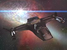
Wraping up this page, the last thing I did was this little scene. The ship was box modeled and then mesh smoothed, and the background was created entirely with Max's Video Post. Which, isn't all that great, but at the time, I though it was amazing. I've since then understood that lense flares are NOT that amazing. But the picture is okay. |
Runaway |

