Max Class 3 |
This assignment was to make some object bounce or fall down the stairs, and have it hit no less than 6 times. Thats right! it's my first 3d animation. I'm pretty happy with how this turned out. Especially for a first try and all. It's layed out vertically so that you can get a small idea of what it might look like animated. Just scroll the page up and down. The real file is Quicktime based, and is about 1-2 megs. Anyone who wants to see it, feel free to contact me. We had to create the object and the environment for it. Both were easy enough, especially to do now, but at the time that was actually hard for me. Heh. |
Truck Tumble |
The 3d Product Ad |
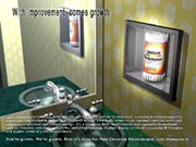
This assignment, was to take a real product, and model it to phtorealism, texture it to photorealism.. it had to LOOK real. It also had to be in an environment that fits it too. Like, you wouldnt find a bottle of advil, in the ocean. Anyway, there was also lots of restrictions to what we could use, and it basically all came down to stuff in the bathroom. So I picked vitamins. I ended up making the bottle really big, so you could see it, but then I thought I'll make a cool phrase to go with this.. hence "with improvement, comes growth". because the vitimans are bigger, and have grown.. GET IT?! Anyway, I'm really happy with this, and it's quite detailed. |
The Machine |
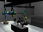
This was a 5 week long one, where we had to create and animate a machine constucting, or destroying, some sort of object. I chose to create something. And I picked a gun to make. Unfortunately, the final product is barely textured, and it doesnt animate like it's supposed to. The reason nothing got textured, is because I had to start this over SOOOOO many times.. due to computer problems That by the time i finally got it SORT OF working, I had no time left to work on it. Sadly, I hate this project, it just failed in so many ways possible, but.. you can still see it! The gun above is what the final product was SUPPOSED TO look like, it's just too bad it didn't turn out that way. |
All Images are Created by Nathan Horsfall Copywrite 2003 and Beyond All Pictures were created using 3d Studio Max R3 |
In the third Max class/quarter with it, we started getting into animation. Some of the things shown here were meant to be seen animated, but I can't upload them on the site, so unfortunately.. stills are the best you're going to get. |
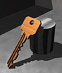
Here is a very simple one.. but it's halfway decent for what it is, so I put it up here. What can I say about this? It's a key.. leaning on a cylinder.. in some box maybe.. Eh, it's okay.. I think the key modeling is pretty nice. Simple spline but ah well. Texturing... needs work. But at the time I made this, i didn't really know about UVW mapping and all that, to get it looking correct. |
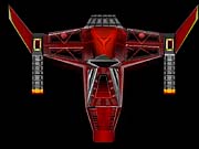
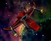
Here's a ship you might recognize. On the MAX class 1 &2 page, the ship at the bottom is actually this guy. This is what it looks like without being mesh smoothed, which i think actually looks better. It was funny because when i made it, I seemed to do something more with it each quarter. Finally during this class/quarter, I sat down with Photoshop for about 6, 7 hours and created the texture map shown to the left. |
And then, I just took that map and planar mapped it over my ship. Simple.. in concept, but that map took a VERY long time to make, and it wasn't easy. Helluva lot of layers (broke 30) and lots of color coordinating to make everything actually work together, and I'm quite pleased at the result! Originally i was going to make this ship blue, but red just fits it better I think. And all of you who say "who cares?" TRUST ME, it does make a difference. |
Red Ship |
Key |


