Others
this part of my computer art is dedicated to the logos/banners that I have done for other people mostly, and a few for myself. But unlike the FotHB and ECHO ones, these were just done as a few, and not a big collection of them. That does not mean they aren't good though, some of these, like the AoT one, are still some of my personal favorites.

This, I did it for a friend of mine. He didnt ask me to, but I saw a real possibility to make a kick ass looking logo from "DRF" Thats what is in that thing, a D an R and an F. DRF means Death Rage Force, and he is one of my serious RP partners. DRF is THE main major adversary Fox faces off against. You can read more on his page, which actuallyhas some information on DRF up there. which can be found here.
click this image for a larger version.
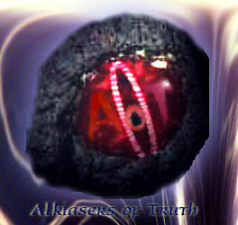
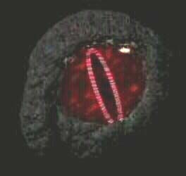
This was done for a friend of mine who started a guild and told me what he wanted done to it, and I did it. I drew up a few rough sketches first, but then put it to work.This was actually done a long time ago, back in '99. Which is surprising because it is actually pretty good quality. The one of the left was all he gave me, and told me to just put "AoT" in the eye. That was all I was given, and I created the one on the right.
Also done for the same friend and for his guild. These were division graphics for him. Also done in '99, these were done before I actually got REALLY good as divisional pictures, and was around the time I was just using word effects only. Reinforcements is about the only one I'm happy with at this point. and only because that was done with Photoshop 3.0 and no fancy filters like
I have now.
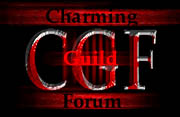
These 3 all went to one person. She flagged me down after reading in my profile on AOL that I make pictures for rosters and basically hired me to do some for her. She was kind of hard to negociate with, because she really couldn't tell me much about what she wanted. All I knew was that it was a Dark Forum, and she wanted me to make 3 different designs. So thats what I did. Obviously there is a blood theme going on, but it's a dark forum, so you have to be sure to keep with the feeling. Personally, my favorite, and the one that was picked, is the 2nd one.
Another picture done for a dark guild(obviously). I really like doing dark pictures because they have more emotion to them, and also more texture for the most part. This is just a picture of a red and yellow evil looking planet, with the words etched into it, and also bleeding. Bleeding text is fun to do >=)


Simple design, but thats what the person who "hired" me to do them for him wanted. Just a spiral of two colors, black and white at first, then other colors, with flashy text over the top. It's amazing that I used to consider THAT high effects text!
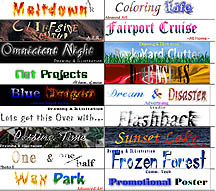
These were all done as tags for my drawings that we had to post for our final presentation in Senior year at High School. And we didnt have to make special tags at all. Just make a tag that shows the title and what class you did the drawing in. I figured that since I didnt have much computer art to show at the time, I could make the tags on the computer. What better way to show off what I could do, then to do something that no one else had even CONSIDERED? Needless to say, it went very well. Some of the drawings with a tag are on this website, others were too big, or 3d, so I couldnt upload them. Can you guess which ones?
Click the picture for a larger version.


For this, one of my friends wanted me to replicate the effect done with text that someone else had done, onto his name. He sent me the Top one and I did the rest. I didn't have the font she used, but I did my best to come damn close to it, and for the most part it is a very good replication, some say it's even better than the original, but i'm just happy I was able to replicate it so well with such limited resources.
All Images created by Nathan Horsfall
Copyright 2003 and beyond