Professional Quality Commercial Art
Here is the Art that I deem professional quality. The Final Fantasy Collages and a few others are actually professional quality I feel, but they were only done for my own personal amusement. That aside, most of these CD covers and posters were done as school assignments, but the heck with explaining them all here, read the decription next to each picture.
And enjoy!
The first pic was done for the hell of it, but turned out pretty well.
The other 2 are CD designs, we had to make a CD cover in this Typograhy class I was in at AIP, and I decided to do the Soundsystem 311 CD because, for those that have seen it, I really think it's garbage. I never excepted it to turn out as well as it did, but I did intend to far better the actual one. The front and back both pertain to soundwaves, there is a soundwave going across the cover, and the back.. well the back is ALL soundwaves. Whatever the case though, I am very very happy with the result. Also, the credits on the back are not right but I only had other CDs to go by, because I don't have that one.


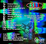

Another CD design, this was done for a friend of mine. Look at it and you'll see what it is, but I threw this is because it does look semi-professional quality. My friend just gave me a playlist, and what he wanted on the front, and I created the rest. Needless to say, him and Erin both loved it. ^_^
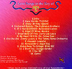
This was also done for Brian, when he got a few friends together and started a band. Originally, they were called "Broke" or "Tattered" but then changed it to "Hydra" and then "Hydra Six-0" when they found there was ALREADY a band by the name of Hydra. And lastly, "Uvis Genuvis" after they got rid of one of the founding members. I will upload the broke and other band designs i did, once I find them.. heh

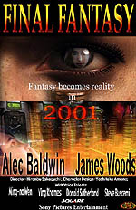
Posters, the first being a movie poster, the second being just some poster for casual purposes.
The first one was an assignment where we had to make a poster for any movie we wanted, and I chose the Final Fantasy movie. I used the pictures from a site called "Stay Tooned" and compiled them all in photoshop. Not all the information on the poster is acurate, but the actors ARE. Funny that, most of these pictures weren't actually in that movie though. What can I say? They changed it after I did this!
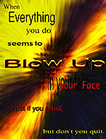
The second one was an assignment to make up some backround, and put text on it, simple as that. I chose a quote from a friend of mine and altered it a little to fit the backround.
All Work is created by Nathan Horsfall
Copyright 2003